Website Design
SaaS Homepage Design: Can Buyers Understand Your Product?
An annotated hero and clarity checklist for founders and marketing leads who want buyers to understand a SaaS product from the first screen.

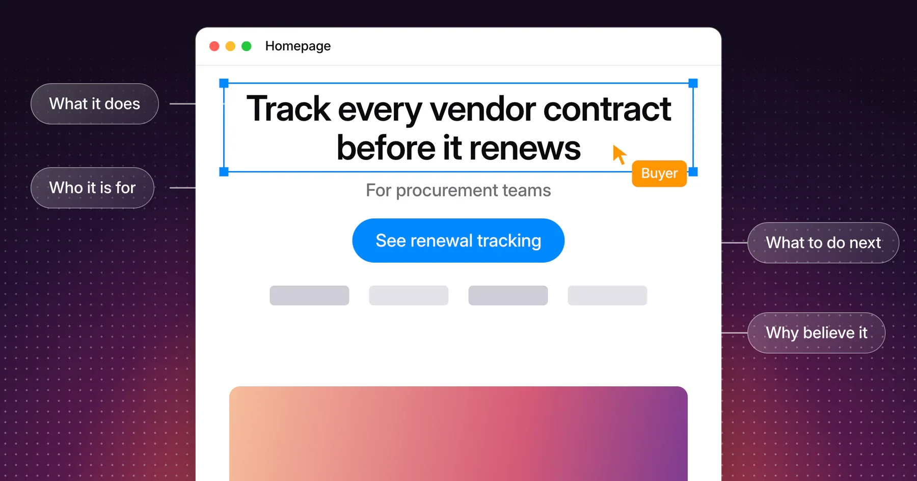
A strong SaaS homepage lets a first-time buyer answer four questions from the first screen: what the product does, who it is for, why to believe it and what to do next. Review those answers together, because a headline, a product visual and a button can each look good while telling three different stories.
This guide is for founders and marketing leads reviewing a B2B SaaS homepage. It includes an annotated hero, a clarity checklist you can copy and a review of a real homepage. It focuses on the first screen and the section directly below it. To decide which pages the rest of the site needs, use the website page structure guide.
Explain what the product does and who it is for
Name the product’s job in the headline and the audience in the headline or the line beneath it. Nielsen Norman Group’s homepage design principles call for a concise tagline that states the offering in the words your users use, because a new visitor may not know your brand.
Write the headline around a job a buyer already has. A category claim fits almost any company, and a specific job only fits yours. The examples below use a fictional B2B tool that helps procurement teams track vendor contracts.
| Element | Vague version | Clear version | What changed |
|---|---|---|---|
| Headline | The future of vendor management | Track every vendor contract before it renews | Names the object and the job |
| Supporting line | One platform for modern teams | For procurement teams that manage renewals across many vendors | Names the audience and its situation |
| Product visual | Abstract gradient with floating icons | The renewals view, with one contract marked Renews soon | Shows the promise happening |
| Primary action | Get started | See renewal tracking | Says what happens after the click |
| Proof | Trusted by industry leaders | Logos of approved customers in procurement, linked to a story | Gives the reader something to check |
Test the headline by putting a competitor’s name above it. If the sentence is still true, it describes the category. Rewrite it until it describes what your product does differently or better for this buyer.
Keep the essential answers near the top
Put the product, the audience and the main action where attention is highest. In a 2018 eyetracking study with 120 participants across several types of web pages, Nielsen Norman Group found that about 57% of page-viewing time fell above the fold and about 74% within the first two screenfuls.
Buyers do scroll, so the first screen does not have to hold everything. It has to give them a reason to continue. Let the product visual or the next section run past the bottom edge, since a hero that looks finished can act as a false floor and hide the page below it.
Connect the headline, product visual and primary action
Make the headline, the visual and the button describe one idea. A reader should be able to follow a single thread from the promise, to the product doing that work, to the step that shows more.
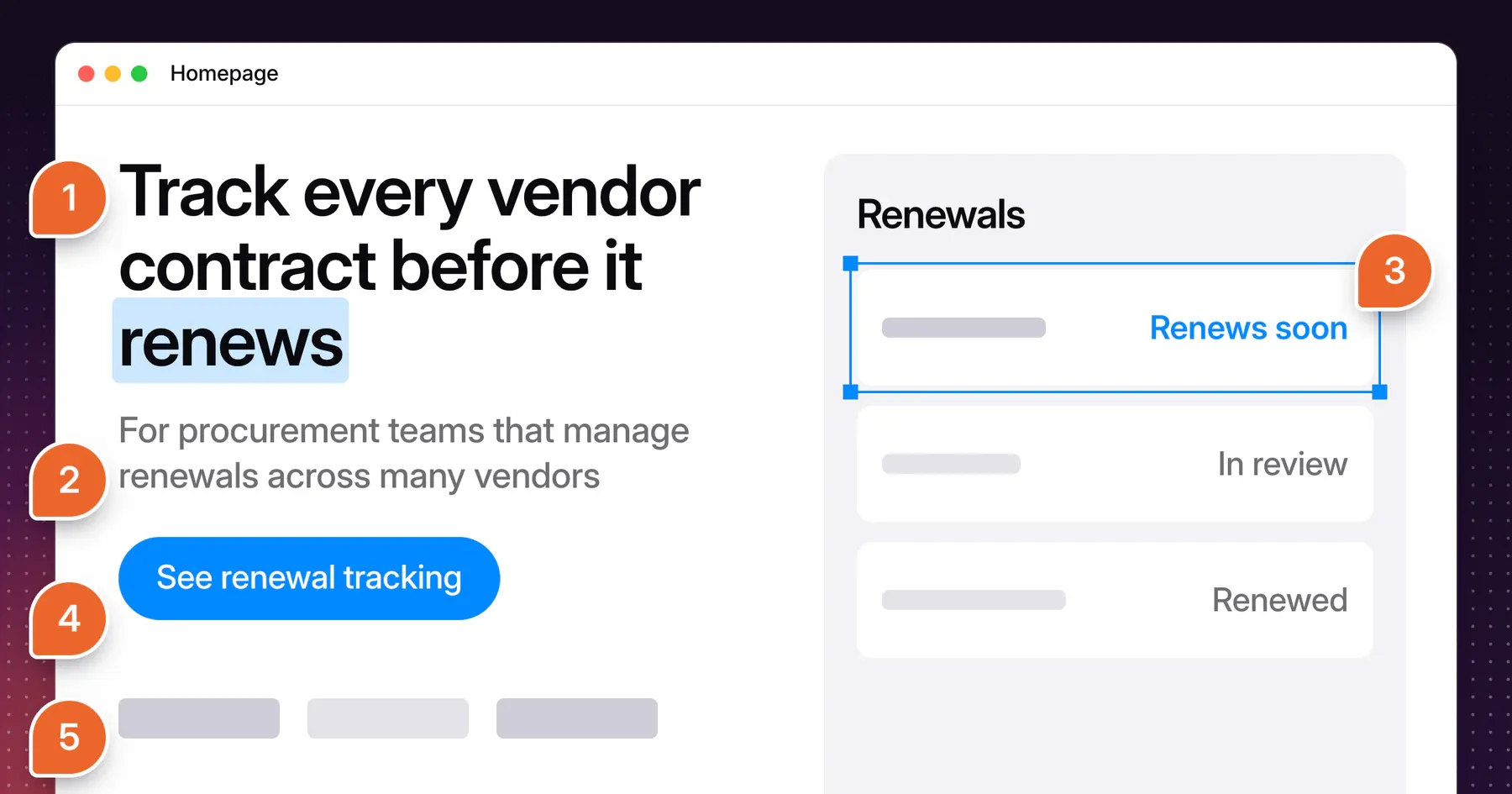
The hero above is a fictional example. Each number matches a row in this table.
| Note | Element | What it has to do | How it connects |
|---|---|---|---|
| 1 | Headline | Name the job in plain words | Sets up the word “renews” that the product view repeats |
| 2 | Audience line | Say who it is for and in what situation | Tells the wrong visitor to leave and the right one to stay |
| 3 | Product view | Show the product doing the job from the headline | Renews soon stands out from In review and Renewed, so the headline’s promise is visible on screen |
| 4 | Primary action | Say exactly what the next page shows | “See renewal tracking” continues the same subject |
| 5 | Proof | Support the claim with something checkable | Procurement customers match the audience line |
Show the real product
Use a real screen, cropped to the moment that matches the headline. Nielsen Norman Group recommends informative imagery over decorative stock photos on homepages. For SaaS, that usually means the one view a buyer would recognize as their own work. A full dashboard at small size asks the reader to find the point, so crop in and mark it.
Write the action as a promise
Label the primary action with what happens next, and match it to your route to purchase. In its article on generic calls to action, Nielsen Norman Group reports that “Get Started” buttons stopped some users from looking further down the page for details, because they assumed the information required signing up.
Use one primary action and, when it helps, one quieter secondary action for people still evaluating. “Book a demo” and “Start a free trial” work when they are the actual next step. “See renewal tracking” works when the buyer needs to understand the product first.
Check the same hero on a phone
Read the first screen at phone width in its real order. The headline, audience line and primary action should appear before the product view, and the product view should stay legible at that size. Replace a wide dashboard with a cropped mobile version when text in the image becomes unreadable.
Keep the headline still, since Nielsen Norman Group advises against animating taglines. Then measure load time on the hero itself. Google’s Largest Contentful Paint guidance sets a good target of 2.5 seconds or less at the 75th percentile of page loads, and a large product image or headline block is the kind of element it measures.
Place proof where the claim needs support
Put each piece of proof beside the claim it supports. List the claims your hero and first sections make, then match each one to evidence you have permission to publish.
| Claim on the page | Proof that supports it | Where it belongs |
|---|---|---|
| Who uses the product | Logos from approved customers in the target audience | Directly under the hero |
| The product does this job | A real screen of that job | In the hero |
| It works for companies like yours | A named customer story with the situation and what changed | Next to the related capability |
| It connects to your tools | The supported integrations | In the capability section |
| Your reviewers can approve it | Certifications you actually hold and a link to security details | Near the final action |
A specific quote from a named customer beats a general rating. When you do not have permission to use a logo or a result yet, make the claim smaller and show the product instead. Evidence the reader can check does more than a large claim with nothing behind it.
Use a homepage clarity review
Run this review with someone who did not write the page, at both desktop and phone width. Mark each row as pass or fix, and start with the rows in the first screen.
| Check | Passes when |
|---|---|
| Product | The headline names what the product does in plain words |
| Audience | The target buyer is named in the first screen |
| Distinction | The headline would be false if a competitor’s name replaced yours |
| Vocabulary | The words match what buyers say in sales calls |
| Product visual | A real screen shows the job named in the headline |
| Thread | Headline, visual and button describe the same idea |
| Primary action | The label says what happens next |
| Secondary action | It serves people who are not ready, and looks quieter |
| Proof | At least one checkable item supports the main claim, close to the first screen |
| Continuation | Something at the bottom edge signals more content below |
| Phone | The same answers appear, in order, and the visual stays legible |
| Speed | The hero content loads within 2.5 seconds at the 75th percentile |
If your homepage fails several rows, the fix may be bigger than a new headline. Record the gaps in a website redesign brief so the work can be scoped properly.
See the review on a real homepage
Here is the same review applied to the Gestures homepage, at 1440 by 900 and at 390 by 844. It reports what the page shows on screen. The next section covers what only visitors can tell you.
| Element | What the page shows | Review |
|---|---|---|
| Product | “Product design and websites with clarity and character.” | Pass. It names both services, and “clarity and character” states how the studio wants the work to feel. |
| Audience | “We work with startups and technology companies” | Pass. The audience appears in the line below the headline, inside the first screen at both sizes. |
| Visual | A design tool window showing a product dashboard, with service tabs above it | Pass for a studio, which sells a way of working. A SaaS company should show its real product here. The window also runs past the bottom edge, which signals more below. |
| Action | “Book a Call” with a quieter “View Selected Work” | Pass. One route serves a ready buyer, and the other serves someone still evaluating. |
| Proof | The “Selected collaborations” logos begin after the hero | Fix. The first screen makes a claim with no proof in view at either size. This is the change the review points to. |
Ask real buyers what they understood
Use a five-second test to learn what people take away from the first screen. Show the hero for five seconds, hide it, then ask open questions: what is this product, who is it for and what would you do next? Lyssna’s guide suggests five to ten participants and treats about 80% understanding the main message as a strong result.
Recruit people who match your buyer, since a general audience cannot judge whether your vocabulary is right. A five-second test measures first impressions and recall, and it says nothing about task completion or sales. Report the method and the sample with the result, such as “X of Y procurement leads named the product’s job correctly.” Avoid claiming that visitors understand a page in a set number of seconds until you have run the test.
Frequently asked questions
What should a SaaS homepage include?
A SaaS homepage should include a headline that names the product’s job, a line naming the audience, a real product view, one primary action, checkable proof and links to product, use-case, pricing and customer pages.
Should a SaaS hero show the product?
Yes, in most cases. A real, cropped screen shows the job the headline promises. A product that is hard to show, such as an API or infrastructure tool, can use a code sample, an architecture view or a before-and-after result instead.
How many calls to action should a homepage hero have?
Use one primary action and at most one quieter secondary action. The primary action serves a buyer who is ready for the next step. The secondary action serves someone who needs to learn more first.
What is the difference between a homepage and a landing page?
A homepage serves every first-time visitor and routes them to the right place. A landing page serves one audience arriving from one source with one action in mind. A homepage has more routes to offer, so its first screen has to be especially clear about what the company does.
How do I know buyers understand my homepage?
Test it with people who match your buyer. Ask them what the product does, who it is for and what they would do next, then compare their words with your headline. Sales call questions after launch show which answers are still missing.
Discuss your marketing website
Bring your current homepage and the questions buyers still ask on sales calls. Explore how Gestures approaches website art direction and design, and we can talk through what your first screen needs to say and show.
Working through a decision like this?
Bring your current product or website and we can discuss what needs attention.
Keep reading