Product Design
SaaS UX Audit Checklist: Find and Prioritize Friction
A task-based SaaS UX audit checklist with a findings template, severity guidance and a worked example for deciding what to fix, test or investigate.

To audit a SaaS product’s UX, choose important user journeys and the roles that perform them, work through the relevant interface states, and record each problem with evidence. Then assess the consequence for the task, how well the problem is understood and what your team should do next: fix it, test a proposed change or investigate further.
The result should be a set of decisions your team can act on. A list of inconsistent screens is only part of the work.
This checklist is for founders and product teams reviewing an existing SaaS application. It covers navigation, core tasks, forms, permissions, feedback and recovery. Use the illustrative examples to guide your own review. This practical checklist is not a validated product score or a complete accessibility, security or performance audit.
Choose representative journeys and roles
Begin with what someone needs to accomplish. Reviewing “the dashboard” gives you an area of the interface; reviewing “find an overdue request and assign it to a teammate” gives you a task with a recognizable outcome.
Select journeys using the context you have: important customer tasks, support questions, known changes, research findings or analytics that need explanation. Record why each journey is included. You do not need to cover the entire product in the first pass.
| Journey | Role | Starting condition | Intended outcome | Reason to include it |
|---|---|---|---|---|
| Create a workspace and complete the first useful action | New administrator | Empty account | A usable workspace with the first task completed | Review the path from setup to product value |
| Find and update an existing record | Returning member | Populated account | The correct record is updated and the result is clear | Examine a recurring task |
| Invite a teammate with suitable access | Administrator | Existing workspace | Invitation sent with understood permissions | Review role and access decisions |
| Recover from an unsuccessful submission | Role performing the task | Form with entered information | Work is preserved and a useful next step is available | Examine failure and recovery |
These are sample journeys. Replace them with tasks from your product, including prerequisites and the roles that can actually perform them.
Record the review conditions
For every walkthrough, note the product version or review date, device and viewport, account role, relevant plan, data setup and starting state. A problem found in an empty trial account may differ from one encountered in a long-running workspace.
Mark each checklist item as checked, issue found, not reviewed or not applicable. “Checked” describes the reviewed conditions, not proof that a feature works for every user. Explain why an item is not applicable and keep unreviewed areas visible in the report.
Use a safe test workspace for actions that change data, billing or access. Arrange the necessary accounts and permissions with the product owner before reviewing those paths.
Check navigation, core tasks and interface states
Use the following checks within the selected journeys. For every issue, capture the step and state where it occurs. Avoid assigning a failure to an entire feature when the evidence concerns one condition.
Navigation and product context
- Location: Can someone identify the current workspace, area and selected item?
- Labels: Do navigation labels describe recognizable tasks or objects consistently?
- Entry points: Can the relevant role find where the selected task begins?
- Context changes: When switching workspace, project or account, is the change clear before an action is taken?
- Return paths: Can someone go back from a detail view without unnecessarily losing the context they need?
Core tasks and decisions
- Next action: Is the next required action distinguishable from secondary choices?
- Decision support: Is the information needed for a decision available at that step?
- Action scope: Before a bulk or destructive action, can someone identify what it will affect?
- Completion: Does the product make the result of a completed action understandable?
- Continuity: Can a person move between the steps without repeatedly entering information the product already has?
Forms and editable data
- Input requirements: Are field labels, required values and relevant format instructions clear before submission?
- Validation: When an input is rejected, does the message identify the field and describe the error?
- Recovery: Where possible, is entered work preserved after an unsuccessful submission?
- Save behavior: Is it clear whether changes save automatically, require an action or remain unsaved?
- Consequences: Before saving important changes, can someone understand their effect on existing data or workflows?
When checking automatically detected input errors, look for a text explanation rather than a color change alone. W3C’s guidance on error identification explains the need to identify the item in error and describe the error in text.
Loading, empty, success and failure states
- Loading: Does the interface indicate that a request is in progress, with behavior appropriate to the task?
- Empty states: Does an empty view distinguish between no existing data, no matching results and data that is unavailable?
- Failure: Does a failed action explain what happened and what can be done next, without claiming success?
- Retry: Does retry behavior avoid leaving the person uncertain about duplicate or partially completed actions?
- Interrupted work: After a session interruption or expired session, is the status of the person’s work understandable?
Roles, permissions and account actions
- Role context: Is the person’s current role or access context clear where it affects a decision?
- Restricted actions: Does a person who lacks access receive an understandable explanation and an appropriate next step?
- Invitations: Can an administrator understand the access an invitation will grant before sending it?
- Account changes: Are workspace, plan or ownership changes described accurately before confirmation?
- Help: Can someone find a relevant route to help when they cannot continue?
Reviewing how permissions are communicated does not establish that authorization is secure. Record a suspected access-control defect for technical investigation rather than treating a hidden button as proof that the underlying permission works.
Accessibility and cross-device use
- Keyboard path: Can the selected task be performed with a keyboard, including menus and dialogs?
- Focus: Can someone see which control has focus, and does focus move in a usable order?
- Labels and feedback: Are controls and important state changes understandable beyond visual placement or color alone?
- Readable layouts: At the reviewed viewport and text size, can someone read the information and reach the necessary actions?
- Consistency: Do recurring controls, labels and interaction patterns behave consistently across the reviewed journey?
W3C’s guidance on visible focus explains why keyboard users need to identify the focused control. These checks can reveal accessibility concerns; they do not establish conformance with all applicable accessibility requirements. Record the methods and assistive technologies actually used, and seek a fuller evaluation when it is needed.
Record evidence, affected users and severity
Convert each issue into a finding another person can understand and reproduce. Keep the observed interface behavior separate from your interpretation of its effect.
“The invitation flow is confusing” leaves too much to interpretation. A more useful finding identifies the role, the step and the missing information, then explains the possible consequence and what remains unknown.
Use this findings template
| Field | What to record |
|---|---|
| Finding ID | A stable reference for discussion and follow-up |
| Journey, role and state | The task, account permissions and conditions reviewed |
| Observation | The behavior or content you directly observed |
| Evidence | A permitted screenshot, recording, reproduction steps, support record or research note |
| Affected task and consequence | What the issue could prevent, delay or make difficult |
| Reach and recurrence | Who may encounter it and how often; mark unknowns explicitly |
| Severity | The assessed consequence for the task, with a reason |
| Confidence | Which parts of the finding are established and which remain assumptions |
| Proposed response | Fix, test, investigate or defer with a reason |
| Owner and dependency | Who can make the next decision and what they need |
| Verification | How the team will check the response in the updated experience |
An expert walkthrough, a customer support message, an analytics event and an observed user session provide different evidence. Describe each source accurately. A drop in a funnel can identify where to investigate; it does not, by itself, explain why people leave.
Separate observation from explanation
Use three short statements when a finding could be disputed:
- Observed: What the interface did under the recorded conditions.
- Possible consequence: How that behavior might affect the task.
- Still unknown: What the review has not established.
Confidence can differ across those statements. You may be confident that an error message disappears quickly while remaining uncertain whether it explains a rise in support requests. Do not attach one confident label to the entire causal story.
Define severity before comparing findings
Use consistent definitions across the review. The following categories help your team compare the consequences of a problem for a task. They are not a certification or a conversion forecast.
| Severity | Working definition | Example consequence |
|---|---|---|
| Critical | A serious consequence requires urgent assessment or containment | A plausible risk of irreversible loss during an important action |
| High | An important task is blocked or requires substantial recovery | A role cannot complete a required workflow through the available interface |
| Moderate | The task remains possible but creates avoidable work or uncertainty | A person must repeat steps or reconstruct context |
| Low | Limited friction in the reviewed task | A presentation inconsistency with little demonstrated task impact |
Severity is not the same as how many people are affected. A serious problem for a small role can still deserve attention. Record reach, recurrence and the availability of a workaround alongside the consequence.
Nielsen Norman Group’s guidance on usability severity considers how often a problem occurs, its impact and whether it persists. The definitions above are this article’s working categories; they do not reproduce NN/G’s numeric scale.
If an issue could cause data loss or unintended access, involve the responsible engineering or security owner promptly. Uncertainty about its reach should not delay checking a potentially serious problem.
Worked example: one finding from observation to decision
This is a fictional interface example for explaining the method. No live product was tested and no customer behavior was measured.
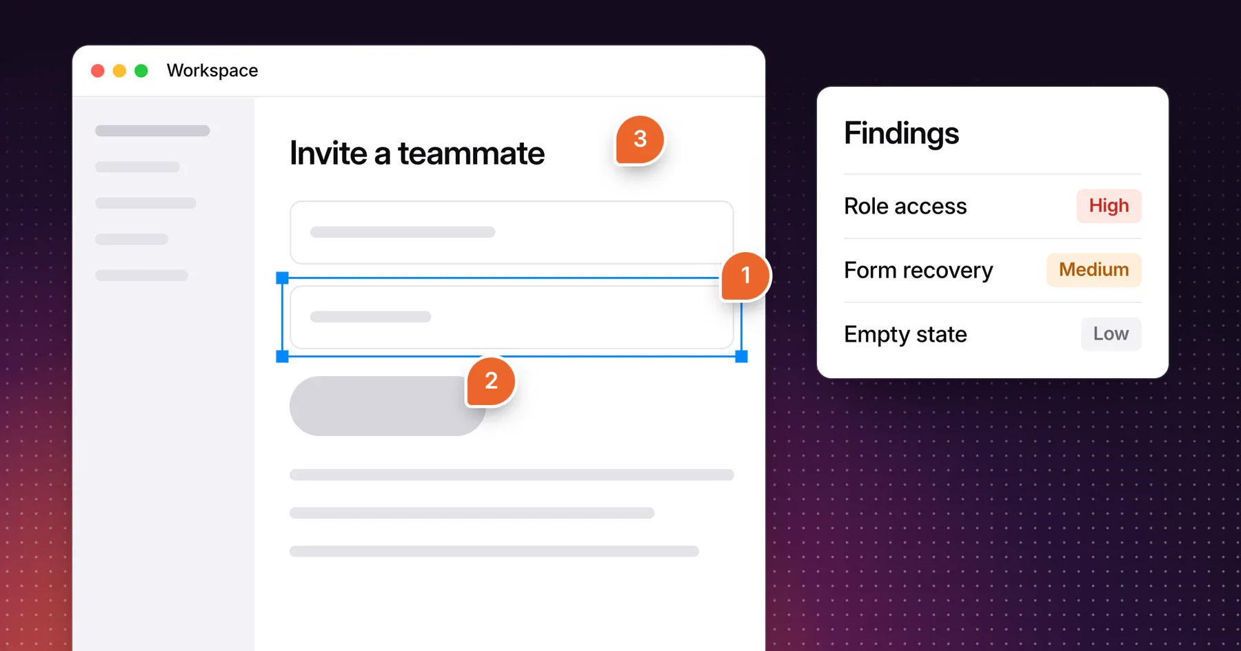
Illustrative interface: An administrator opens an invitation dialog. The role selector offers “Member” and “Administrator,” but the dialog contains no explanation of what either role can do. A general help link appears elsewhere in the settings area.
Annotation 1, role selector: Record exactly which labels and descriptions are available at the decision point. Do not infer that every administrator misunderstands them.
Annotation 2, Send invitation action: Identify the decision being committed: inviting someone with a particular level of access. Check whether another step explains or confirms that access.
Annotation 3, help route: Record whether relevant guidance is available before sending the invitation and whether the selected role can reach it.
| Finding field | Illustrative entry |
|---|---|
| ID | INV-01 |
| Journey and role | Administrator invites a new teammate |
| State | Invitation dialog before submission |
| Observation | The example dialog provides role names without capability descriptions |
| Evidence | Fictional interface specification above; no production screenshot or user-session evidence |
| Affected task | Selecting suitable access before sending an invitation |
| Possible consequence | The administrator may choose a role without understanding its scope |
| Reach and recurrence | Unknown; would require product and usage evidence |
| Severity | Provisional moderate for decision uncertainty; reassess if real behavior creates unintended access |
| Confidence | Behavior is defined in the fictional example; real user understanding and business impact are untested |
| Proposed response | Check existing guidance and actual permission behavior; evaluate concise capability descriptions with intended administrators |
| Owner and dependency | Product/design owner with engineering confirmation of permissions |
| Verification | Check that descriptions match implemented capabilities and evaluate whether administrators can make the intended access decision |
The next step is not automatically a redesigned dialog. The team needs to know whether accurate guidance already exists, whether the permission model is understood and whether the proposed change helps the relevant users.
Decide what to fix, test or investigate
Review the findings with product, design and engineering. Combine observations that share an underlying cause, while retaining the journeys and evidence linked to each one.
Use consequence and uncertainty to choose the next action. Consider effort and release dependencies after identifying the problem; ease of implementation should not decide whether a serious issue matters.
| Situation | Useful next step | What to record |
|---|---|---|
| Reproducible defect with a clear intended behavior | Fix and verify | Expected behavior, implementation owner and regression conditions |
| Observed friction with an uncertain explanation | Investigate | The missing evidence and a bounded way to obtain it |
| A proposed solution whose effect is uncertain | Test | The task, intended users and decision the test should inform |
| Potential serious harm with incomplete evidence | Assess and contain promptly | Responsible owner, immediate checks and safe interim action |
| Limited consequence and no pressing dependency | Defer deliberately | Reason, review trigger and owner |
Avoid multiplying subjective severity, confidence and reach estimates into a precise-looking revenue score. If your team uses a scoring method, preserve the underlying evidence and explain its limitations.
Turn a finding into an implementation ticket
Include the starting conditions, reproduction steps, expected behavior, relevant evidence and acceptance checks. Define what remains outside the ticket.
For a form recovery issue, the acceptance checks might cover the original input, the error state, whether entered work survives and whether the retry completes once. These checks describe the intended behavior; the implementation owner should confirm the technical approach.
After the change, repeat the affected journey under the recorded conditions. Where the finding concerned user understanding, review the updated experience with relevant users rather than treating a shipped design as proof of improvement.
Know what the review does not establish
A checklist review can identify concrete interface problems and questions worth investigating. It cannot demonstrate that every user encounters the same difficulty, prove the cause of churn or guarantee a change in activation.
Keep these boundaries in the report:
- Journeys, roles, states and devices that were not reviewed.
- Evidence sources that were unavailable.
- Recommendations based on expert judgment rather than observed user behavior.
- Accessibility, security or performance concerns requiring further evaluation.
- Product decisions that depend on pricing, policy, operations or technical constraints beyond the interface.
Some findings lead to a focused change. Others suggest a shared component problem, a need for research or a broader product decision. An audit does not need to end in a full redesign to be useful.
Frequently asked questions
Can we run a SaaS UX audit without analytics?
Yes. You can begin with a scoped walkthrough and any available research or support evidence. Mark reach and behavioral impact as unknown where the evidence is missing. Record observed interface problems accurately, then identify what additional information would help prioritize them.
Is a UX audit the same as usability testing?
No. An audit is a structured review whose methods should be stated. Usability testing involves observing relevant people attempting tasks. An expert review can raise plausible problems, but it should not be presented as evidence that users experienced them unless that observation actually occurred.
How many journeys should we review?
A practical starting point is three to five journeys tied to activation, core value and revenue, with the relevant roles and states represented. Add more only when the decision your team faces needs them, and note what you left out.
Should the highest-severity issue always be built first?
Not always. Serious consequences need prompt attention, but the next step may be investigation or containment rather than immediate redesign. Consider the evidence, safe response, dependencies and responsible owner. Keep that decision visible instead of relying only on a ranked list.
Will an audit tell us whether we need a full redesign?
Yes, it gives you the evidence for that decision by showing where problems occur and whether they share a cause. A local issue may need a targeted fix, while recurring structural problems may justify broader work. Scope the response after reviewing the findings and constraints. For the scope decision that follows, compare targeted UX fixes or a product redesign.
Discuss the UX issues you want to address
Start with the task people need to complete, the evidence you have and the part of the experience that needs attention.
Explore Gestures’ product UX design work, then bring the workflows and open questions you want to discuss. We can consider the work you have in mind and whether Gestures is the right fit.
Working through a decision like this?
Bring your current product or website and we can discuss what needs attention.
Keep reading